Northern New Jersey November 2005 Home Sales Data
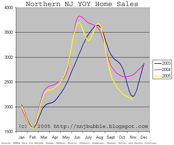
November sales data is in! Regular readers will likely recognize this graph, I've been updating it each month for a few months now. For new readers, this graph shows year over year unadjusted sales for 2003, 2004, and 2005. The reason I think this graph is important is that it shows the normal seasonality of the real estate market and allows comparison of current sales with historic sales for the last 2 years. This graph is based on GSMLS sales for the counties specified on the graph only. It does not include NJMLS or other FSBO sales. However, due to the fact that GSMLS is the largest MLS system in this area, I have faith that this graph illustrates the trends just fine. This data alone would be inadequate to use on a county level. Also, just because I get asked every time I post this. An analysis like this on a city by city level would be inappropriate, the sample size is much too small thus making the data too volatile, it's only when you look at multiple counties aggregated that you get a true picture of activity.
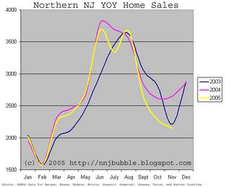
I think this data illustrates the anecdotal evidence we've been hearing about perfectly. Unlike the NAR and NJAR data that contains data up to 4 months old, this data is 'fresh'. We can see that sales fell off relatively quickly after the summer peak come in significantly below last years numbers. It will be interesting to see how we track through the traditionally dead February. If you thought DOM numbers were getting high now, just wait until February.
Caveat Emptor,
Grim

5 Comments:
Grim:
Can you clarify better the data points?
If the graph is monthly data, the curvature of the plot implies that the data is continuous through the passage of time.
If the data is instead a single point representing the entire month, then a straight line between sample points would be more appropriate.
I know this comment sounds arcane, but the curve implies a much stronger trend that may in fact be the case.
Aesthetically, the curve obviously looks much better, but I don't think that is your priority.
In and of itself it isn't all that interesting, the trough is only slightly below that in 2003.
Combine it with the fact that interest rates are creeping upwards, and the picture gets far more interesting.
"what we haven't seen are adequate price reductions that typically follow a drop in sales"
Very true. For eg on X street in my town, although the max sales price for a house has been only 319K so far (thanks domania), the new listings are still coming out at between 329k and 399k asking. I am sure actual sales are taking place for lesser but the realtors are trying to keep up the pressure on buyers by listing high I think. It looks like "what we ask should not be a deterrant to your approaching us with your bid."
We have to wait 6 months to understand where the curve is exactly going.
Do NOT trust the manipulation and spin from real estate industry. These self-serving people are onlky out for their own lifestyles.
First time buyers are screwed in this market.
I have been following a site now for almost 2 years and I have found it to be both reliable and profitable. They post daily and their stock trades have been beating
the indexes easily.
Take a look at Wallstreetwinnersonline.com
RickJ
Post a Comment
<< Home