The Illustrated Bubble
Is There a Housing Bubble?

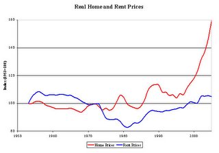
The rental index is the Bureau of Labor Statistics (BLS) rent index from 1953 to 1982 and its owners equivalent rent (OER) index from 82 to 2005. (The OER is somewhat cleaner because it strips out the impact of utility price changes -- these are not supposed to be included in the rent proper index either, but it is difficult for BLS to strip out utility costs completely. The OER index began in 1982, prior to 1982, the rental index is the rent proper index.) The home price measure is the BLS ownership component of the CPI prior to 1982 (when the series was discontinued) and the Office of Federal Housing Enterprise Oversight House Price Index from 1982 to 2005. The movement in the two indexes is averaged for the 7 years where they overlap (1975-82). Both the ownership and rental indexes are deflated by the CPI-URS and CPI-UX1, the standard deflators.
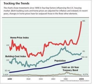
The second graph is from an article in Barrons, originally taken from Shillers book.


3 Comments:
Grim -
You come up with the most compelling, interesting, educational stuff to prove the existance of a housing bubble. Thanks again for everything you have done, and hopefully will continue to do.
The Facts all are screaming BUBBLEMANIA. Send this info to media people. Tell'em to rebuff it and print it.
You JUST GOT TO LISTEN AND HAVE FAITH THE FACTS CANNOT BE MANIPULATED.
Prudence and Thrift will be rewarded. Patience.
I have been following a site now for almost 2 years and I have found it to be both reliable and profitable. They post daily and their stock trades have been beating
the indexes easily.
Take a look at Wallstreetwinnersonline.com
RickJ
Post a Comment
<< Home